I am picky when it comes to design books. I have an unlimited wish list but a limited budget so I want to make sure I’m getting a good one. Besides wanting the obvious beautiful pictures and detailed information I want something that can be referenced and enjoyed again and again and again. When I not-so-subtly expressed my desire for Restoring a Home in Italy around Christmas-time, I knew it would pass the book criteria test. It’s March and I’m still in amore with this one.
Elizabeth Minchilli and Simon McBride have featured 22 restored homes all across Italy…. some are very rustic and simple, others a little more tailored, and some just wonderfully eclectic.
If you love Italian design or are looking for authentic inspiration, you must take a look!
These are just a few of the wonderful images in the book, and believe me I’ve been sitting here paralyzed trying to select the images to share!
I’m fascinated with how shutters are used in Europe. They really are so interesting- from the design and the hardware and the abundance of them in general… Shutters like this are so not the norm here, and I can’t imagine why not! This dark green color is used quite frequently, and looks even more smashing behind overflowing geranium pots!
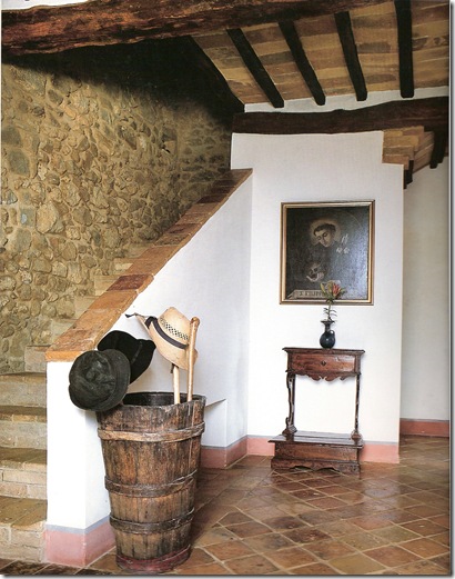
Look at all the wonderful rustic materials in this entryway. I love the old barrel as an umbrella/hat stand and the exposed stone wall.
Open shelves and exposed storage are the norm in European kitchens. It’s quite lovely with this thick and sleek marble countertop.
This Kitchen is the inspiration for the Outdoor Kitchen of a home I’m working on. Those thick plaster shelves & surrounds and the massive hood are just so sculptural. Notice how the “cabinetry” becomes a backdrop for the focal point in the room- the farm table where family gathers and bonds.
The living room of the same house appears very Axel Vervoordt too me. It must be the earthy neutrals and simple statement pieces that bring him to mind.
I loved this image because of it’s modern windows. Of course some homes in Italy are being restored to reflect the current time- and the juxtaposition of modern and ancient is very cool.
Simple, useful and unpretentious sure does add up to lovely.
Antiques in the bathroom are always a good thing. Especially when they find a fun use like this bookshelf! As in the kitchens above, this bathroom has no typical base cabinet. By excluding them, we’ve seen much more creative spaces.
Yum- it all looks good here, scenery, table and food!
Wouldn’t yard work and gardening be so much more fun with a trough sink like this? In fact, I don’t think it’s a green thumb one needs, just a stone trough sink!
I mentioned before that this book is a must for those interested in authentic details. Besides every single picture in the book, there are also several features on construction details in the describing roofing, stairs, terra cotta patterns , doors, etc. It’s a wealth of knowledge that's also very fun to look at… so in the end this has been a winner book selection. Not only have I looked at it over and over again, I may wear out the pages!


6 comments:
This book does look wonderful - straight to my wish list, xv.
So lvely! I really like the neutral rooms and the bed is to die for!
xx-Gina
Thanks for the tip on the book! Living abroad, I long for English language books and like you, I'm picky, as I want to get the most "bang for the buck". I'm taking your advice and ordering myself months of enjoyment off Amazon.
Good Tip.
Yours,
Toma
This looks like a great choice. Love that kitchen!
–Lana
What a stunning place! Wouldn't it be fabulous to rent out for a week or two? You'd be in heaven!
I know that I'd have a greener thumb if I had a sink like that in my yard. Thanks for sharing the photos!
Post a Comment