Merci Betty Burgess. Your French inspired interiors have been haunting me all week. It's been delightful!
This California home, which is currently gracing the cover of Veranda, is the perfect mix of French Country and Parisian Chic. Simple, large scale furnishings and accessories keep each piece interesting. And there's nothing like Zebra to provide a little edge. My favorite detail in the Family Room has to be the herringbone patterned “door” that conceals the TV. Doesn’t it looks great with the limestone fireplace?
This Kitchen = Drop. Dead. Gorgeous.
I am in some serious Kitchen love. Where do we start… the stunning huge slabs of Carrera Bianco Statuario Marble, the Stainless La Cornue (THE range of all ranges), the reclaimed beams on the ceiling, the enormous apothecary jars filled with culinary goodies, the clean-lined hood cover which is so perfect in here (anything more and it would be fussy instead of chic)... Maybe it’s a good thing this isn’t my kitchen as I’d been to busy admiring it to cook!
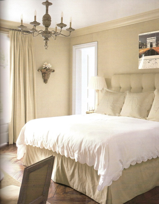
Oh good, there’s a place to rest after all that eye candy in the Kitchen! The monochrome palette of the Master Bedroom creates such a soothing and sophisticated atmosphere. I love the oversized monogram on the shams and the scallop edge on the duvet. Oh wait, the eye candy didn't stop in the Kitchen- notice the oak herringbone floors and the pretty chandelier!
You can see the rest of the photographs of this tres magnifique house in the April 2009 issue of Veranda.
Get ready to swoon!


5 comments:
I am swooning and salivating. Thanks for finding such delightful eye candy. Have a great weekend. Heidi
I was so impressed with her work in the latest copy of Veranda. I had never heard of her, and yet she lives in Atlanta! I wish I could get an image of the beautiful dining room from this house, but it spanned two pages, and would be hard to scan.
I wonder why all designers do not have websites in this day and age?
i am not a beige person .....but the bedroom with all the beige, and the dark walnut herringbone floor is so yummy !
beautiful blog !!
HI
Great post! and incredible blog ! Very helpful post! I must say. Simple & interesting. Wonderful work!
thank you!
Great post thaanks
Post a Comment