There’s nothing like a bold print on an antique chair to bring it new life.
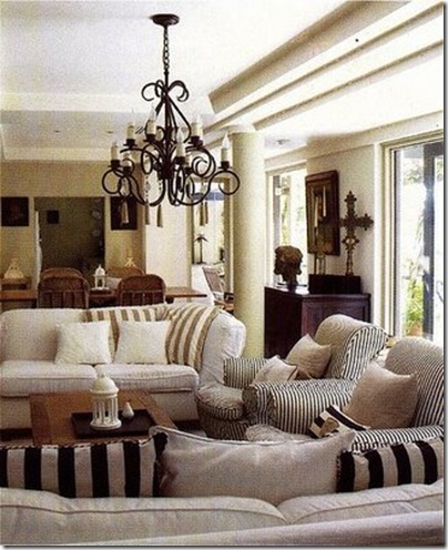
Stripes are always a good thing in my humble opinion. I like the contrasting trim on the bias of the black and white throw pillows in the image above.
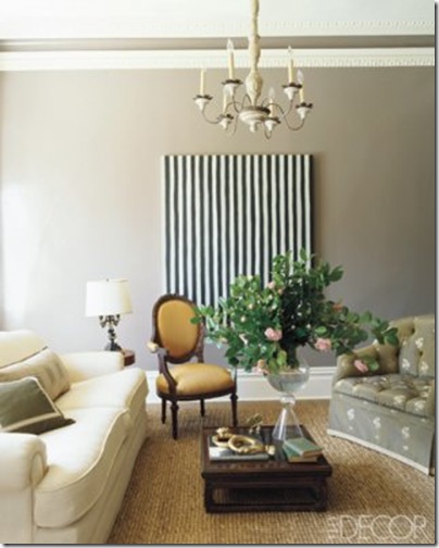
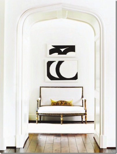
Artwork is always an easy way to make a statement.
As is an eye-catching floor pattern.
I love how the herringbone floor and the bright white tub interior stand out even more against the black walls of this bath. Also loving the mix of brass plumbing fixtures instead of the expected silver.
Textiles can add a dose of pizzazz as well… and a little zebra never hurts (note the “little” please).
Nor does a little black and white toile, especially when contrasted with large-scaled masculine furnishings and huge white blossoms.
{Images via 1. Style court, 2. Decorno, 3. Elle Decor, 4?, 5, Kikette Interiors, 6. VT Interiors, 7. & 8. Western Interiors magazine, 9. Decorpad, 10. Domino magazine}


1 comment:
The black bathroom is still on my tops list!
Post a Comment