Tuesday, March 31, 2009

Searching for Scrolls

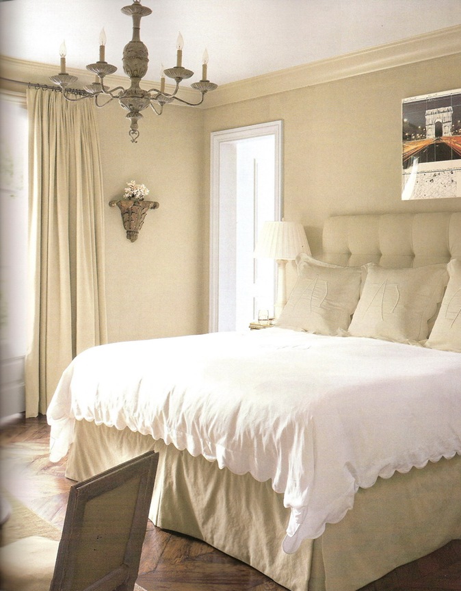
Vicki of the lovely blog French Essence and author of the beautiful book My French Life must be feeling her nose itch and her ears burn this week. Joni from Cote de Texas blogged about Vicki's gorgeous Provencal farmhouse Mas de Bernard a few days ago, and I am now borrowing inspiration from her elegant bedroom.

Redoing our master bedroom has been on my mind lately. Strike that, it's actually become an immediate and necessary task that's now on my schedule as well as on my mind!

I want the space to be soothing, refreshing, and have a little glamour and interest to it. Vicki's bedroom sums up those qualities. Her antique passementerie headboard leaves me absolutely speechless.


I'd love to incorporate a similar decorative pattern in a simple way... perhaps with these embroidered scroll pillowcases.


If Restoration Hardware wasn't sold out of the white set above, thats where you'd find me right now!


I've got a few thousand more pictures to look through to make sure I haven't missed a single inspiring idea (can you sense the sarcasm), but I think Vicki's bedroom decor will stay on my mind as I continue this search.


{Photos via My French Life, Scandia Down, and Restoration Hardware}

My Bachelorette Pad


  IMGP1077 

Before I got married, I lived in a cute little house.   It started out being not such a cute little house but after more elbow grease and trips to the hardware store than I like to remember it was quite a nice place to call home.  We’ve rented it out until just recently, and the search is on for new tenants.  Know anyone looking to live in Phoenix???


IMGP1232 

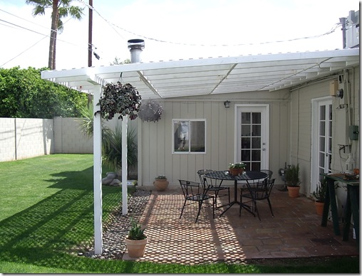
A great little patio for a Sunday brunch!


IMGP1167

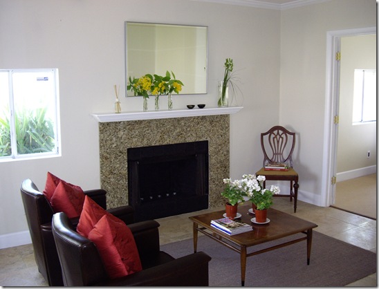
I took this picture when I had the house on the market and had de-personalized it a bit.  My wing chairs had just been recovered in a golden linen, and you can see the carpet tile area rug.

We ripped up the awful carpet that had been throughout the house when I moved in and found the concrete floors in a very good condition.  The concrete in older homes in Phoenix is naturally this cinnamon color that comes from the mixing of clay with the concrete.  These floors are always cool to the touch and so low maintenance!   The larger base and the crown molding make it a little more “dressy industrial".


IMGP1234

Walls once separated each room, but now the house is bright, airy and open.


IMGP1162

One of my favorite design elements for a Kitchen is open shelves.  I adored having these- not only did they look so interesting and cottage-y, but they were so convenient!  I kept all the things I used frequently right there in wicker baskets and glass canisters.


IMGP1159

I set up the Kitchen with more of a “Butler’s Pantry” where the refrigerator, pantry cabinet, and stacked washer & dryer were kept in the hallway to the right of the picture above.  It opened up the Kitchen so much and definitely adds to the vintage feel of the house.  There's a powder room off of the Butlers Pantry and the covered patio through the French door.


  IMGP1176

This is the "Family Room” or what you see through the breakfast bar opening.  Though I never lit a fire here in toasty Arizona, I put the fireplace to much use displaying candles! 


 IMGP1093

The Powder Room is painted in thick stripes of the same color with a different sheen.  It’s very subtle and makes this little space special.  I was overjoyed when I found the porcelain handle faucet at a salvage shop, and then saw the same model at Home Depot a few days later!  Ce la vie!


IMGP1252

The three bedrooms and the office are all carpeted in this same wool “sisal” rug.  This has the look of something more unique and textural like a sisal but is soft to the touch.  The rug dealer whom I purchased this through always compares a wool carpet to a fine wool suit.

I tend to always see a space as I envision it to be once it’s done…. before this room was painted or the moldings had been installed in I said to my then-fiancĂ©, “Doesn’t it remind you of a hotel suite?”  From his look of utter confusion, I don’t think he was thinking of the same caliber of hotel that I was envisioning at the time!


     IMGP1064

The bathroom has a little glamour and a little modernity with its glass vessel sink and the venetian-style mirror. 

I’m off to another showing with a potential tenant, and hopefully this process will conclude quickly so I can spend less time on Craigslist and more time on my favorite blogs!

Saturday, March 28, 2009

One Picture


 cdt renea abbott kitchen    

A few days ago I stumbled upon a challenge posed to Lauren at Pure Style Home- she had been challenged by Alek of From the Right Bank to the Left Coast to select a SINGLE photo to define her current style.   Of course, this set me off on the search for my one photo.  Instead of finding a picture that said a thousand words, I seemed to find just thousands of pictures… and then I landed on this Kitchen image by designer Renea Abbot of the wonderful Shabby Slips.  I think this pretty well sums up my style today:

  • A relaxed setting that invites people in and makes them want to linger over conversation
  • A neutral and fresh background using wood, painted surfaces, and marble
  • Color coming from accessories, rather than major elements themselves (so much easier to change them when you’re in for a new look!)
  • Antiques juxtaposed against clean lines
  • An industrial edge, brought in from all the stainless steel in this kitchen
  • Florals/Botanicals in a simple and monochromatic arrangement
  • Linens and china in a casual and elegant setting
  • China displayed as art – you can see the edge of a pretty white dish displayed on the countertop to the right of the picture
  • One single pattern used in moderation… Here, this comes from the zebra fabric on the French style chairs
  • Bling from glassware and accessories grouped together (notice how pretty the bottles of wine and oil look next to the range and the neatly lined up refrigerator contents!)… one thing that could make this kitchen more my style right now would be a rock crystal chandelier above the table

1st dibs sutter antiques rock crystal chandelier 

  • The only other thing I would change in this room is to have an antique French oak floor laid in a herringbone pattern… since this is a hypothetical challenge, I think my hypothetical budget could certainly accommodate this!

x surfaces herrinbgone natural


What is your style today?  Is there an image or inspiration that sums it up?  Don’t worry, if you find thousands like I did, the question is what your style today.  Another picture can definitely qualify for your style tomorrow!  Enjoy your search and please share your find!

{Photos from Cote de Texas. Sutter Antiques via 1st Dibs, and Exquisite Surfaces}

Friday, March 27, 2009

Friday Flowers


How to be a RECESSIONISTA FLORISTA:
Head to Trader Joes where you can buy 10 stems of daffodils for only $1.29!!!

Thursday, March 26, 2009

Not your typical wine rack


 Cottage Living June 2007- Michael Lee0002

Upon first glance of the Kitchen above, I was smitten with the graphic quality of the wine rack.   Very surprisingly, I learned it was made of terra cotta “pipes”…  who would have guessed!  For something that's been around for centuries, it sure looks stylish and modern  in this application.  These ones have been painted white and stacked on top of each other… a perfect accent in this  clean lined kitchen.


cdt octagon home wine display 

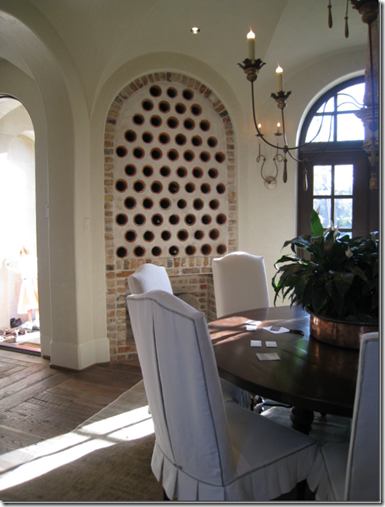
I was reminded of this very cool idea when I saw this Dining Room on Cote de Texas.   Here the house is more traditionally European and so is the installation of the pipes.  They’re built into the plaster wall and the rim of pink terra cotta peaking out brings a lot of natural earthy charm to the look.


PHG terra cotta wine rack

Here’s a close up of a similar application where the pipes are buried into the wall.  Notice how this installation and the one on Cote de Texas dress it up with a decorative frame of another material. 

The look can go from Mod to Mediterranean very easily.  I know which of these looks is my favorite… what is yours???

{Photos via Cottage Living, Cote de Texas, and Phoenix Home and Garden}

Tuesday, March 24, 2009

Book Love: Restoring a Home in Italy

Restoring a Home in Italy0001

I am picky when it comes to design books.  I have an unlimited wish list but a limited budget so I want to make sure I’m getting a good one.  Besides wanting the obvious beautiful pictures and detailed information I want something that can be referenced and enjoyed again and again and again.  When I not-so-subtly expressed my desire for Restoring a Home in Italy around Christmas-time, I knew it would pass the book criteria test.  It’s March and I’m still in amore with this one.

Restoring a Home in Italy0006

Elizabeth Minchilli and Simon McBride have featured 22 restored homes all across Italy…. some are very rustic and simple, others a little more tailored, and some just wonderfully eclectic. 

If you love Italian design or are looking for authentic inspiration, you must take a look!


Restoring a Home in Italy0010

These are just a few of the wonderful images in the book, and believe me I’ve been sitting here paralyzed trying to select the images to share! 

I’m fascinated with how shutters are used in Europe.  They really are so interesting- from the design and the hardware and the abundance of them in general…  Shutters like this are so not the norm here, and I can’t imagine why not!  This  dark green color is used quite frequently, and looks even more smashing behind overflowing geranium pots!
 

Restoring a Home in Italy0018 

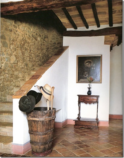
Look at all the wonderful rustic materials in this entryway.  I love the old barrel as an umbrella/hat stand and the exposed stone wall. 


Restoring a Home in Italy redos0001

Open shelves  and exposed storage are the norm in European kitchens.    It’s quite lovely with this thick and sleek marble countertop.


Restoring a Home in Italy0024 

This Kitchen is the inspiration for the Outdoor Kitchen of a home I’m working on.  Those thick plaster shelves & surrounds and the massive hood are just so sculptural.  Notice how the “cabinetry” becomes a backdrop for the focal point in the room- the farm table where family gathers and bonds.


Restoring a Home in Italy0027

The living room of the same house appears very Axel Vervoordt too me.  It must be the earthy neutrals and simple statement pieces that bring him to mind.


 Restoring a Home in Italy0019

I loved this image because of it’s modern windows.  Of course some homes in Italy are being restored to reflect the current time- and the juxtaposition of modern and ancient is very cool. 


Restoring a Home in Italy0023

Simple, useful and unpretentious sure does add up to lovely.


 Restoring a Home in Italy0041-a

Antiques in the bathroom are always a good thing.  Especially when they find a fun use like this bookshelf!  As in the kitchens above, this bathroom has no typical base cabinet.  By excluding them, we’ve seen much more creative spaces.


Restoring a Home in Italy0021

Yum- it all looks good here, scenery, table and food!


 Restoring a Home in Italy0042

Wouldn’t yard work and gardening be so much more fun with a trough sink like this?  In fact, I don’t think it’s a green thumb one needs, just a stone trough sink!

Restoring a Home in Italy redos2 

I mentioned before that this book is a must for those interested in authentic details.  Besides every single picture in the book, there are also several features on construction details in the describing roofing, stairs, terra cotta patterns , doors, etc.  It’s a wealth of knowledge that's also very fun to look at… so in the end this has been a winner book selection.  Not only have I looked at it over and over again, I may wear out the pages!

Friday, March 20, 2009

Friday Flowers

After the sunflowers in Veranda, I just had to see more. I think this little French chalkboard sign really sets off the yellow don't you? (Haha). Have a cheery Friday!

{Photo via French General}

Thursday, March 19, 2009

Merci Betty Burgess

Veranda April 2009- Betty Burgess interiors0006-a

Merci Betty Burgess. Your French inspired interiors have been haunting me all week. It's been delightful!

This California home, which is currently gracing the cover of Veranda, is the perfect mix of French Country and Parisian Chic. Simple, large scale furnishings and accessories keep each piece interesting. And there's nothing like Zebra to provide a little edge. My favorite detail in the Family Room has to be the herringbone patterned “door” that conceals the TV. Doesn’t it looks great with the limestone fireplace?

Veranda April 2009- Betty Burgess interiors0006-b

This Kitchen = Drop. Dead. Gorgeous.

I am in some serious Kitchen love. Where do we start… the stunning huge slabs of Carrera Bianco Statuario Marble, the Stainless La Cornue (THE range of all ranges), the reclaimed beams on the ceiling, the enormous apothecary jars filled with culinary goodies, the clean-lined hood cover which is so perfect in here (anything more and it would be fussy instead of chic)... Maybe it’s a good thing this isn’t my kitchen as I’d been to busy admiring it to cook!

Veranda April 2009- Betty Burgess interiors0007

Oh good, there’s a place to rest after all that eye candy in the Kitchen! The monochrome palette of the Master Bedroom creates such a soothing and sophisticated atmosphere. I love the oversized monogram on the shams and the scallop edge on the duvet. Oh wait, the eye candy didn't stop in the Kitchen- notice the oak herringbone floors and the pretty chandelier!

You can see the rest of the photographs of this tres magnifique house in the April 2009 issue of Veranda.

Get ready to swoon!

Tuesday, March 17, 2009

It's a day for green treats...


Forget the green beer, milk or bagels... it's time for a St. Patrick's Day style makeover. I think these pretty well do it!
{Photos from Veranda and Cafe Cartolina}

Friday, March 13, 2009

Tuesday, March 10, 2009

Gigi

Want to go to Paris? Let's visit Gigi. She's a beautiful, elegant Parisian... of the apartment sort!

Gigi has a lovely living room. All white upholstery, opposing sofas, a cushy ottoman with fresh flowers...so comfy. The chartreuse accents really bring the space to life. I love the fabulous trumeau mirrors above one of the sofas, mirroring the windows on the opposite wall and bringing in more natural light and so much elegance.


The large Armoire at the far wall really anchors the furniture arrangement and is such a wonderful contrast to all the light furniture. Even the basket casually placed on top of it adds to the charm and relaxed feel to the space.


I can't believe we've gotten this far without mentioning Gigi's wall decor- a multitude of plates and platters on display. Shiny white china in repeated shapes is really keeping Gigi youthful. I love the oh-so-European-details of the interior shutters and the scrolling ironwork too.


Gigi's quite eclectic- trumeaus, china and antlers all on one room... a French girl can pull off anything.


One last look before we head into the Dining Room. There are many traditional and antique styles here yet it's anything but stuffy. The light fabrics, monochrome palette, and selective use of color (and trendy color at that) keep it looking fresh and hip.


Simplified statement pieces are in Gigi's Dining Room. That is quite the table, and like the Armoire in the Living Room, it is the contrasting "anchor" to this room.


Many of the pieces in here are oversized, which is actually quite unique for a Parisian apartment. The consistency in scale keeps clutter and fuss to a minimum.


The furniture and seating arrangement is very interesting, and very unlike most American Dining Rooms. There are actually several seating areas in this one space between the table, the daybed, and the slipper chairs flanking the fireplace. Notice another mirror above the fireplace for reflective light.


Chevron wood floors... oh je t'aime...


Isn't it amazing to see the efficiency of a Parisian Kitchen??? I'm amazed. Even in Gigi's utilitarian spaces she's beautiful- open shelves, great glass front cabinet, and of course a crystal chandelier.


Gigi's bedroom is pure linen heaven. I feel refreshed just looking at it...


The Water Closet uses a cute alternative for toilet tissue storage and has a charming little sink.
It appears that all the walls are tiled, which is so much more interesting than paint.


The Bathroom has more intricate tile work than the Water Closet and more decoration, including these wonderful framed botanicals. The furniture piece is a great alternative to a traditional cabinet.


On the way out don't forget to see the other charmer, the Service bath. The plumbing fixtures themselves aren't anything too special; in each space its the details like the framed mirrors and decorative lighting that bring it to life. I think it's such a cool concept to make these baths extensions of the decorated interiors first, and bathrooms second.


Gigi's view... it's so typically Parisian and so pretty.


Now that we've seen all of Gigi, you must be wondering how to get in touch so that you can stay with her next time you are in Paris. Virtually visit her here.


Bon Nuit!