A few days ago I stumbled upon a challenge posed to Lauren at Pure Style Home- she had been challenged by Alek of From the Right Bank to the Left Coast to select a SINGLE photo to define her current style. Of course, this set me off on the search for my one photo. Instead of finding a picture that said a thousand words, I seemed to find just thousands of pictures… and then I landed on this Kitchen image by designer Renea Abbot of the wonderful Shabby Slips. I think this pretty well sums up my style today:
- A relaxed setting that invites people in and makes them want to linger over conversation
- A neutral and fresh background using wood, painted surfaces, and marble
- Color coming from accessories, rather than major elements themselves (so much easier to change them when you’re in for a new look!)
- Antiques juxtaposed against clean lines
- An industrial edge, brought in from all the stainless steel in this kitchen
- Florals/Botanicals in a simple and monochromatic arrangement
- Linens and china in a casual and elegant setting
- China displayed as art – you can see the edge of a pretty white dish displayed on the countertop to the right of the picture
- One single pattern used in moderation… Here, this comes from the zebra fabric on the French style chairs
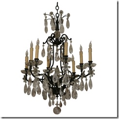
- Bling from glassware and accessories grouped together (notice how pretty the bottles of wine and oil look next to the range and the neatly lined up refrigerator contents!)… one thing that could make this kitchen more my style right now would be a rock crystal chandelier above the table
- The only other thing I would change in this room is to have an antique French oak floor laid in a herringbone pattern… since this is a hypothetical challenge, I think my hypothetical budget could certainly accommodate this!
What is your style today? Is there an image or inspiration that sums it up? Don’t worry, if you find thousands like I did, the question is what your style today. Another picture can definitely qualify for your style tomorrow! Enjoy your search and please share your find!
{Photos from Cote de Texas. Sutter Antiques via 1st Dibs, and Exquisite Surfaces}


Great style! That's a great question...almost scary to have to chose!
ReplyDeleteI am intrigued by the idea of picking one picture - I have literally 4000 pictures in my flickr account. I first read about this on Pure Style Home too, and I love the idea!
ReplyDeleteI like the idea of plates as art too, but mainly in the kitchen or in the dining room - rooms where you eat. It always catches my eye!
In this picture, I love how the designer used art in the kitchen. I don't think I could ever have one of those glass front fridges, though - the inside of my fridge is not the most organized place!
Great post.
I don't think I could commit to one image. I am such a design schizophrenic!
ReplyDeleteI can see why you selected this picture. I am always drawn to neutral spaces.
The Exquisite surfaces antique French oak floor is one of my favorites as well. It has such character.
Great post.
xo
Brooke
Thanks for playing along! It's so cool that you chose a kitchen. I think you're the only one so far. And that chandelier and floor are both great. I had floors like that in my last place and I LOVED it.
ReplyDeleteAlice!! It's beautiful!! I can picture that chandelier in there perfectly & I have that flooring ripped out of an ad in a magazine. LOVE it and love your style!! :)
ReplyDeleteDon't you love this tag? It's such a challenge and so fun!
ReplyDeleteAnd that kitchen? Swoon---those chairs are too fab for words!