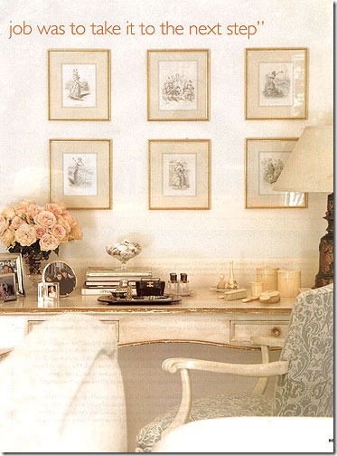
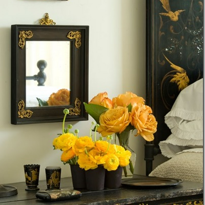
I really love the look of a framed collection and think it’s a great way to fill a wall with artwork in a budget friendly way. I’ve been eyeing framed collections where the mat or the background is an unusual color…. it keeps things classy and coordinated while adding a lot of interest!
Kathryn M. Ireland via House Beautiful
How bold and beautiful are these blue mats!?! Can you imagine how lifeless these pretty birds would seem on a plain white mat?!?
A thin border of a bold color works so well too…
Simple, inexpensive Ikea frames look so sophisticated with these linen background mats… not to mention how much the artwork really pops against them! Another benefit to something like this is that Ikea mat openings are not standard to American photograph or artwork sizes… this solves that problem!
I love the subtle accent of color these pink rimmed mats bring to these black and white illustrations. Perfect for a soothing nursery!
Gilded edges with black and white is very handsome!
Love the combination of the burlap colored mats and the mostly black prints… so historic but so fresh because of the airy design of the rest of the room!
While this mat isn’t colored, I love how the background is! It’s bold but simple at the same time. Again, you could easily take a plain-Jane Ikea frame and make it into something like this.
Hope you found some inspiration in these!


![blue-mats-via-holly-mathis-interiors[2] blue-mats-via-holly-mathis-interiors[2]](https://blogger.googleusercontent.com/img/b/R29vZ2xl/AVvXsEjySEZS6UjHXO0YaLUVFIfJs6XsMdmuWw2SakL-drUWVC3ynzFpn6g_UTfKr_4jll2rGxcg9N5Txt-GtF5Nn49_wqiHGxYNQnvnSHIIdY04JHKbtRkmi2IjnR6hjHKJ1C_KIkah0T_cuVCY//?imgmax=800)


No comments:
Post a Comment