Every year there is THE new color palate of the Christmas season, or at least the one that I personally fall for! For me, one year it was blue, last year it was lots of green and silver, and this year it’s deep rich cranberry red. Of course, with all the decorations on the market you can really get any color any year- it’s almost hard to NOT find what you’re looking for.

Rich, saturated red… It’s as though you’re looking through red tinted glasses… so dramatic!
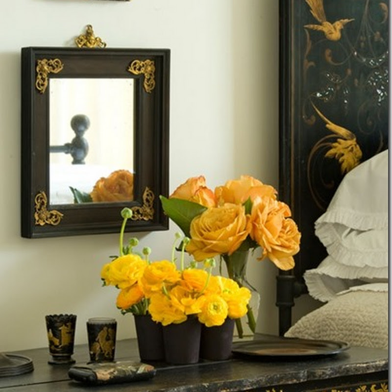
 Fun, flirty, and young. Especially with the pop of lime green.

Isn’t this a fabulous hanging centerpiece?!? Great DIY project for someone more ambitious than me this time of year. The red becomes ultra modern in front of so much white.

While I love all the more conventional red color combinations, I wasn’t really excited to decorate this year until I decided upon this- ruby red and fuschia. So rich in color and intensity, but pretty and fun at the same time…. It screams FESTIVE to me.

I was enamored by the way that so many other colors can be incorporated to this theme- gold, emerald, lime, silver, white…. there’s something static and impersonal about a tree or color scheme that is too contrived and strict… while I love the look of them in pictures and catalogs, I think the idea of being able to use favorite ornaments and decorations that might not fit your theme is so much more authentic and charming. The picture above from Vicki Archer’s French Essence this week PERFECTLY exemplifies this type of charm!

Of course, a festive table setting is like icing on the cake. Robert Haviland’s “Elizabeth” setting nods to the traditional and is super chic. I love how graphic the pattern is.

Spode Bordeaux dinnerware has such gorgeous intensity and depth in it’s cranberry red banding.

For the modern table, Bodo Sperlein’s Red Berry is spectacular. A client of mine uses this pattern and it is constantly complimented! Crate and Barrel came out with a knock-off a few years ago, and while it was a wonderful alternative for one who didn’t want to make that as expensive of an investment, it was not nearly as delicate or pretty. This would be gorgeous with colorful glass ball ornaments scattered across the tabletop or with red branches like in the first picture above.
What colors are you gravitating towards this season???
{Pictures via 1. Carolyn Roehm , 2. House Beautiful, 3. I Suwannee, 4. everything LEB, 5. French Essence, 6-8. ???}