Monday, December 13, 2010

Fun and Easy Ornament Displays

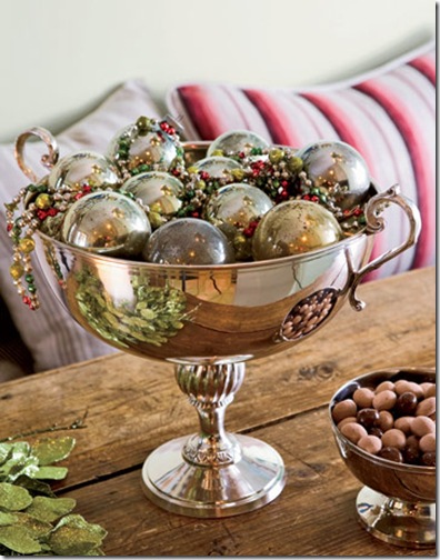
These ornament displays are almost prettier than if the ornaments were on a Christmas tree… and don’t you always seem to have too many ornaments and not enough tree???  I love how this adds a little shine and a pop of color to another corner of the house…

   country living ornaments-jar-de

CLX1207Kendall602-de 

country home tricia foley christmas 2 

          Copy of vt interiors library christmas decorations


{Photos via 1. & 3. Country Living, 2. ???? , 4. VT Interiors}

Friday, December 10, 2010

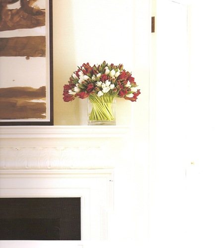
Friday Flowers

Michael George Simply Elegant Flowers- red and white tulips

{Photo via Simply Elegant Flowers with Michael George}

Friday, December 3, 2010

Christmas color inspiration: RED


Every year there is THE new color palate of the Christmas season, or at least the one that I personally fall for! For me, one  year it was blue,  last year it was lots of green and silver, and this year it’s deep rich cranberry red. Of course, with all the decorations on the market you can really get any color any year- it’s almost hard to NOT find what you’re looking for.   

carolyne roehm red branches

Rich, saturated red…  It’s as though you’re looking through red tinted glasses… so dramatic!

 House Beautiful red and white paper garland Fun, flirty, and young. Especially with the pop of lime green.


i suwannee bookshelves with red christmas ornaments

Isn’t this a fabulous hanging centerpiece?!? Great DIY project for someone more ambitious than me this time of year.  The red becomes ultra modern in front of so much white.


everything LEB pink and red ornaments 

While I love all the more conventional red color combinations, I wasn’t really excited to decorate this year until I decided upon this- ruby red and fuschia.  So rich in color and intensity, but pretty and fun at the same time…. It screams FESTIVE to me.

Christmas decorations collections via grench essence

I was enamored by the way that so many other colors can be incorporated to this theme- gold, emerald, lime, silver, white…. there’s something static and impersonal about a tree or color scheme that is too contrived and strict… while I love the look of them in pictures and catalogs, I think the idea of being able to use favorite ornaments and decorations that might not fit your theme is so much more authentic and charming.  The picture above from Vicki Archer’s French Essence this week PERFECTLY exemplifies this type of charm! 


    Robert Haviland Elizabeth- 740 fv pc

Of course, a festive table setting is like icing on the cake.  Robert Haviland’s “Elizabeth” setting nods to the traditional and is super chic.  I love how graphic the pattern is.


 Spode Bordeaux dinnerware

Spode Bordeaux dinnerware has such gorgeous intensity and depth in it’s cranberry red banding.

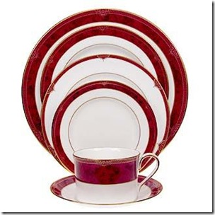
Bodo Sperlein Red Berry

For the modern table, Bodo Sperlein’s Red Berry is spectacular.  A client of mine uses this pattern and it is constantly complimented!  Crate and Barrel came out with a knock-off a few years ago, and while it was a wonderful alternative for one who didn’t want to make that as expensive of an investment, it was not nearly as delicate or pretty.  This would be gorgeous with colorful glass ball ornaments scattered across the tabletop or with red branches like in the first picture above.

What colors are you gravitating towards this season???

{Pictures via 1. Carolyn Roehm , 2. House Beautiful, 3. I Suwannee, 4. everything LEB, 5. French Essence, 6-8. ???}

Thursday, November 25, 2010

Friday, November 19, 2010

Friday Flowers

sc000430c4

Pardon the looooooooooong absence!  Still alive and kicking over here!    The past few months have certainly been busy!  A very happy and even busier baby and almost full time design work haven't left much time for blogging… but the holiday season is always a fun time for both design and blogs- there’s just so much to see and talk about!  So hopefully posting will be a little more regular around here, meaning more than 1 post every 3 months!

Saturday, August 7, 2010

ON THE BEACH

Richard Misrach - On the Beach cover

Perfect for this time of year, I recently came across the book On the Beach.  It is an amazing collection of photographs by Richard Misrach. 

Richard Misrach- On the Beach series Untitled #80-2004 chromogenic print via Fraenkel Gallery

While at first glance I was immediately enthralled by the beauty of each image, of the crystal clear water, and of the tranquility of each picture, his intent with this collection was not quite so superficial.    The events of 9/11 moved him to explore the vulnerability of people, juxtaposed here with a vast open ocean.   Feelings of solitude accompany the visual beauty of each of these.

Richard Misrach - on the beach

After reading this interview with the artist, I was so intrigued that each of these very different photographs was taken from the exact same spot on his balcony in Hawaii.

       Richard Misrach- On the Beach series

Despite his purpose in suggesting fragility, it would be divine to be one of these ladies floating your afternoon away. Cute hat by the way (clearly I’m not a serious art critic with that comment!).

I adore the color of water.

002_MisrachUntitled213_0420

The colors and the textures of the sand are so eye catching.

Richard Misrach- Untitled 1132-04 2002 chromogenic print

Makes me think of Slim Aarons. 

Richard Misrach on allery wall

Most of these works are very large- about 6’ x 10’.  Makes a beautiful image even more spectacular.  I love how simple and pristine these are and wish I could find an image of one of these in an interior setting (other than a gallery).  

For those of you who love photography, this book is a stunner.  At  16” x 20” it’s much larger than your typical art/coffee table book.  The large size makes it all the more enticing and lets you see the detail of each work so well.   If you can’t make it to the beach this summer, this book is surely a visual vacation.

Wednesday, August 4, 2010

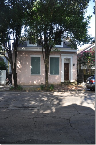
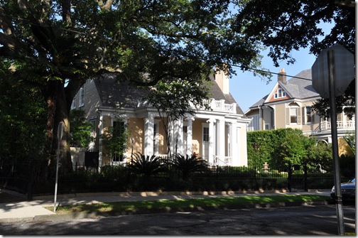
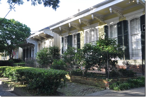
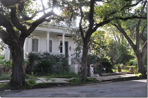
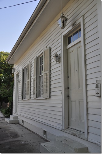
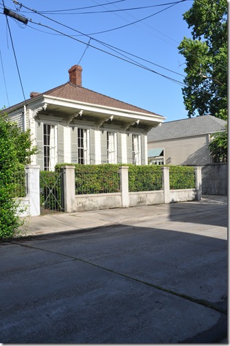
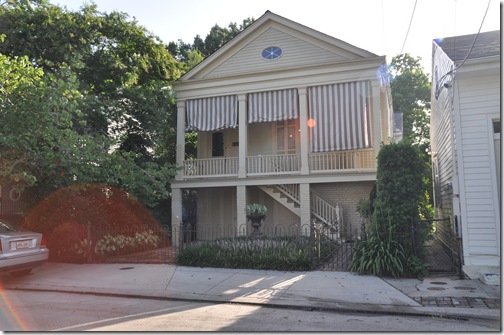
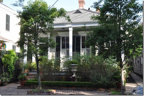
NOLA Fabulousness: A Walk through the Garden District

The only downside to living in a neighborhood as beautiful as this one would be to see a wacko like me zooming my camera in on your house…but creepiness aside, it’s flattering, no?

 DSC_0385  

Give me a house with full length shutters and I’m a happy girl!


 DSC_0393

Can’t see the actual house but the lush greenery and pretty lantern sure are pretty!


DSC_0396

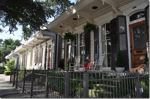
Now that’ s Front Porch.


DSC_0407

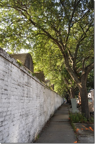
A romantic sidewalk that gives you just a peak of an iconic and somewhat mysterious New Orleans cemetery.


DSC_0408 

Love the mossy brick steps…

DSC_0417

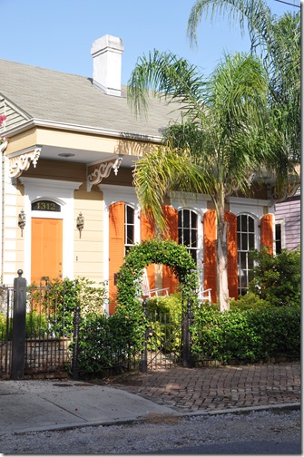
Pretty in pink


DSC_0421 

In a class of it’s own… I picture whoever lives here always to wear perfectly pressed linen clothing and drink mint juleps out of monogrammed sterling mint julep cups!


DSC_0387

Gorgeous hanging baskets.  The house isn’t too bad either!


DSC_0422 

Shotgun love.  As in the house.


DSC_0423 

Old trees and a classic beauty….


DSC_0429

Charming white on white…


DSC_0430

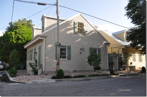
One of my favorite color schemes of a NOLA house: off white with taupe shutters.


DSC_0431

Fabulous striped shades and a petite but perfectly landscaped courtyard.


DSC_0434

White on white with some color pops seen through the windows.


DSC_0435

Lanterns are everywhere. 


DSC_0439

Another house where small doesn’t restrict elegance! 


DSC_0440

Another row of shotgun cuties


DSC_0441

The array of architecture is truly amazing…


DSC_0443

Just the array of shutter styles and colors is amazing too!


DSC_0390

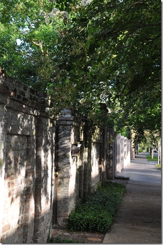
Normally it’s frustrating to not see past the front gates when trying to house stalk, but these walls are pretty enough to satisfy my prying eyes!


DSC_0392

See, show us a pretty gate and we don’t need to see your pretty house (though I still want to see it)!

Hope you enjoyed the walking tour! 

For next time I must allow more time, and perhaps a better zoom!!!

Monday, August 2, 2010

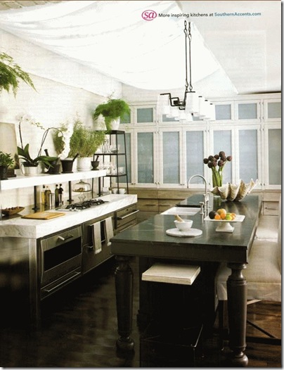
Greenhouse inspired Kitchens


Light, bright, airy, and FRESH…

  McAlpine Booth Ferrier Baltimore kitchen

The white fabric shade is so innovative!  It diffuses the light in this kitchen so beautifully and adds such textural interest.

McAlpine Booth Ferrier Baltimore kitchen 2  

Love the open shelves and crisp finishes.

mcalpine trading spaces kitchen

Another bright ceiling, an abundance of natural materials and plants, and more open shelves.  It’s the perfect industrial meets residential mix!

Both of these kitchens are by the very talented Bobby McAlpine and Greg Tankersley.

Bobby’s new book The Home Within Us is on my wishlist and he’ll be interviewing with the ladies of The Skirted Roundtable this week--- definitely will be tuning in to hear it!!!

{Photos via McAlpine Tankersley}

Friday, July 30, 2010

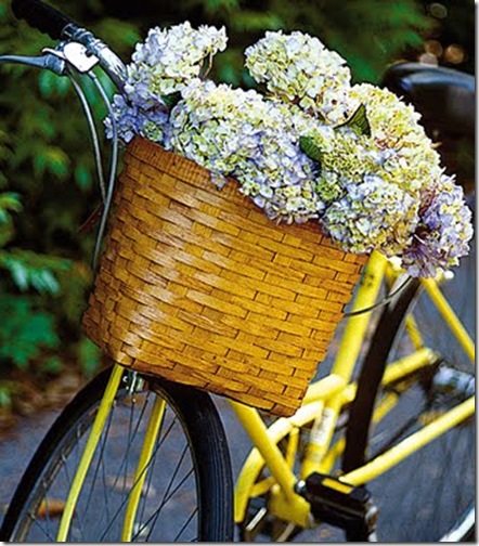
Friday Flowers: Summery

compulsively compiled hydrangea in bike basket

Reminds  me of a Cape Cod summer!

Have a great weekend!

{photo via Compulsively Compiled}

Wednesday, July 28, 2010

NOLA Fabulousness: Julie Neill Designs


julie neill

Another of my highly anticipated shop visits when in New Orleans was to Julie Neill Designs.  Those who frequent design blogs will certainly recognize her beautiful fixtures as they’ve been featured on some other great blogs, including Julie’s own Bayou Contessa

The shop itself is enough to lose one’s composure over- it’s on Magazine Street with a candy pink front door and perfectly patinad floors, walls and ceilings.  The fixtures could not be set in a more perfect backdrop.  I was truly like a kid in a candy store here- so much so that I didn’t even realize until we left that my camera was turned on the wrong setting and all my pictures turned out like this:

DSC_0356 

Bet you want me to hire me as your photographer now, huh? Ha! 

Luckily for this post and for all of us who can’t stop by in person, Julie has a beautiful website that has recently been revamped and showcases her designs much better than I could have even if I did take better pictures!
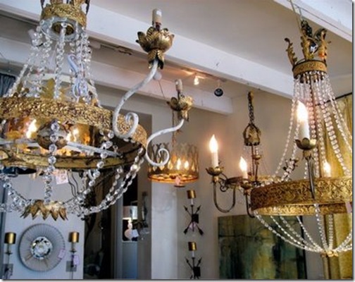
julie5 via all the best

While I did not get to meet Ms. Neill herself that afternoon, I met several ladies in her shop who were all incredibly hospitable and charming, including her director of sales Julie Ponze.  You can tell everyone at the company truly loves what they do and has a  thoughtful focus on each specific project.

julie neill- jenny bubble chandelier 

This might be my favorite of Julie’s chandeliers- the Jenny Bubbles chandelier.  It’s clearly influenced by a beautiful French chandelier, but it’s been sassed up to perfection.  I love those little swirls and how they clearly convey this is a new fixture with an artistic twist.


julie neill- bella chandelier

The Bella chandelier- appropriately named.
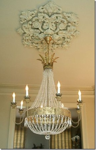
 

julie neill- juliette chandelier with ornate medallion

Julie’s designs integrate seamlessly into traditional homes and historical grandeur.  This Juliette chandelier works so well with this antique medallion.


 julie neill- carolina chandelier

I love how this Carolina chandelier is made funky with modern round bulbs instead of candelabra tip bulbs.  So versatile…
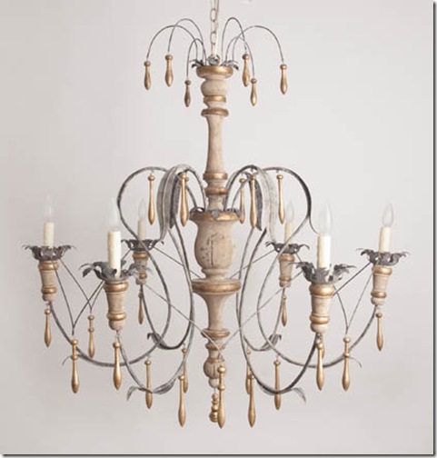
julie neill- savannah with connected arms

Julie’s take on a painted wood chandelier.  Isn’t it gorgeous?

julie neill-marguerite

You can truly see the artistry in some of the more modern fixtures, like this Marguerite chandelier.


   julie neill- fleur de lis sconce

My favorite sconce, the Fleur de Lis, is spectacular in this silver leafed finish. 


OLYMPUS DIGITAL CAMERA julie neill- danica sconce with ball   julie neill- milk punch

I’m set on use using of these tall skinnies in a project!  I love how simple and elegant they are, but each has such personality.  They can be made so different from each other based on finish, the use of a shade, and decorative detailing.  From left to right: Artemis, Danica (which comes in so many design and finish options and looks so different in each!), and Milk Punch. 
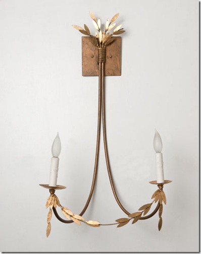
 

 julie neill- maria sconce

A theme that can be found throughout many of her pieces is a leaf garland, shown here on this Maria sconce.

 julie neill- jamie sconce 

The sconces run the gamut from modern and flirty to elegant ad traditional.  The wood Jamie sconce is shown here.


Besides the numerous fixtures that are in her catalog and showroom, there are quite a few photographs of customized work.  I find that one of the best services any product designer can offer!
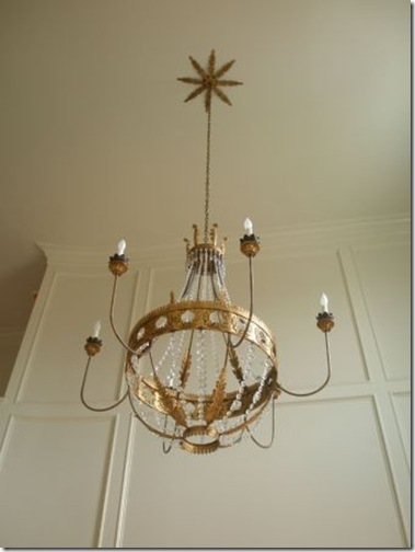
julie neill- Custom Vanessa Chandelier with Sunburst Canopy

This is a custom Vanessa chandelier with a sunburst canopy.  How pretty is that little detail?
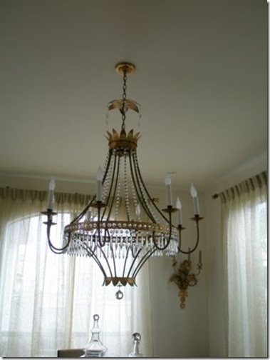
 

julie neill- denise chandelier with custom chain collar

Denise sconce with custom chain collar, making this instantly unique.
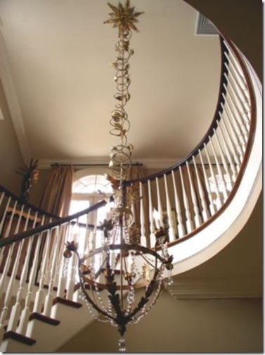
 

  julie neill- joy chandelier with custom chain ebelleshment and canopy

The Joy chandelier with a custom chain that is completely eye catching and amazing.  The sunburst canopy is also custom and I love how the entire fixture has been well thought out and truly made a focal point of this foyer.

Julie Neill- saints inspired chandy

Perhaps the most festive of her custom pieces shown is this customized Saints chandelier.  Geaux Saints!


What sets these light fixtures apart from the multitude of stuff out there, is that these are not just lights but pieces of art.  Truly.  They’ve been created by a person who knows design, not a mass-producing corporation. 
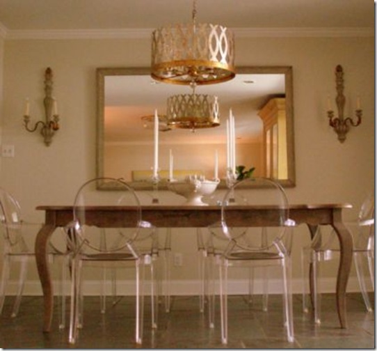
julie niell- custom ingrid chandelier

The Ingrid chandelier bridges traditional and modern just as well as it mixes finishes.  I absolutely love the gilded finishes!

julie neill- plaster chandelier the big easy life

The plaster Martin chandelier is fantastic play on materials.  And just to bolster how cool it is- this is a shot of artist Amanda Talley’s home.

julie neill- earth chandelier

The Earth Chandelier is truly a piece of sculpture.
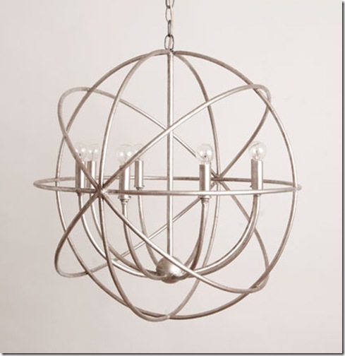
 

 cosmos chandelier

The Cosmos chandelier would be perfect in a contemporary setting.  I love how there is a fixture for every style here.


The finishes here are superb.  If a fixture is supposed to look patinad, it does.  No fake “old world” here.   The gilded finishes are to die for.  I’m currently in a silver mood and I couldn't get enough of the gilded half shades on some of the sconces.  The painted finishes are very pretty too, and what makes them even better are their names- Prytania Taupe, Creole Rust, Orleans gold, Bywater Black.  I have no shame in admitting that I’m totally swayed by the names of colors and finishes! 

julie neill- glazed giltOLYMPUS DIGITAL CAMERAjulie neill- patina gilt


Julie Neill’s specialty is her lighting fixtures- chandeliers, sconces, lanterns, etc, however there are more goodies in her repertoire than just lights. 

    julie neill- custom vanityNew Vanity LR    Garland%20Demilune

I think these vanities are SO cool.  Hand crafted design, amazing finishes, and voila you’ve got yourself a total statement piece.  How fabulous would a modern glass vessel sink be in contrast to these?

 

julie neill- show house mirrorjulie neill- blue scroll mirror

She has mirrors that run from simple to ornate.
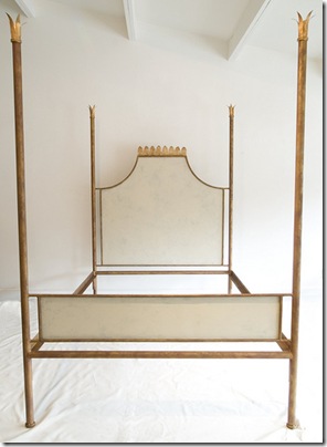
julie niell- customb ed

Even a bed fit for a queen!

As you meander through the shop, one room opens onto the next and furniture arrangements comfortably make you feel as though you’re walking through a home.  There are beautiful tablescapes, accessories, and modern artwork filling each space.

goodbed_thumb1 aok_thumb1 julie neill- dancer

You’ll want them to wrap up the whole room to take home with you.

The fixtures speak so well to the surroundings they find themselves in.  Here are a few more installation shots:
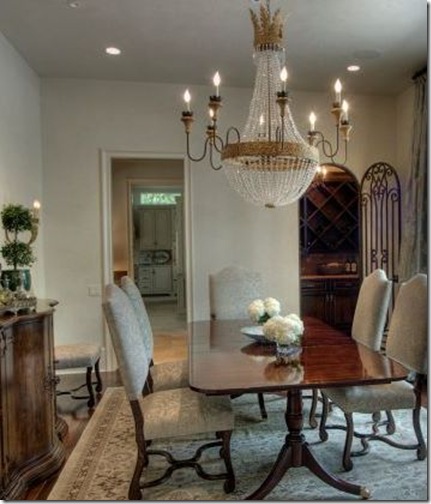
       julie neill- juliette chandelier 

julie neill- juliette chandelier with round table       

julie neill- savannah chandelier  

julie neill- things that inspire foyer

Recognize this pretty picture? It’s Holly’s foyer from Things to Inspire.

julie neill- celeste


So if you’ve been searching for a new stunner of a fixture, the game is over, no?  I know I can’t wait to use these fixtures in projects and my own home!

There’s a wonderful interview with Ms. Julie Neill on All the Best that I’m sure you’ll enjoy reading.  Also make sure to see the new Julie Neill Designs website and Bayou Contessa blog.  If you are in New Orleans you’ve got to see these beauties in person- be ready to be smitten!

{Photos via Julie Neill Designs website, Bayou Contessa blog, Julie Neill Design’s Flick photostream, All the Best blog}

Related Posts Widget for Blogs by LinkWithin