I’ve been busy planning away the nursery for my April baby for months and could keep searching (obsessing) to no end…BUT the deadline is fast approaching and I think there’s plenty of inspiration from these beautiful nurseries to end the planning and start the doing!
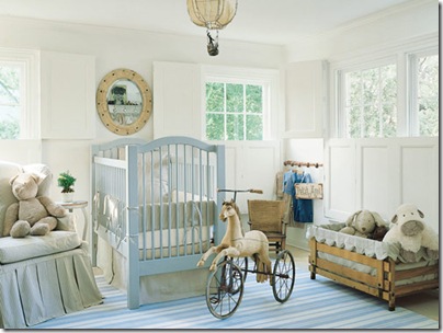
So many elements from this light and airy Swedish inspired nursery could move on with the child as he or she grows older…
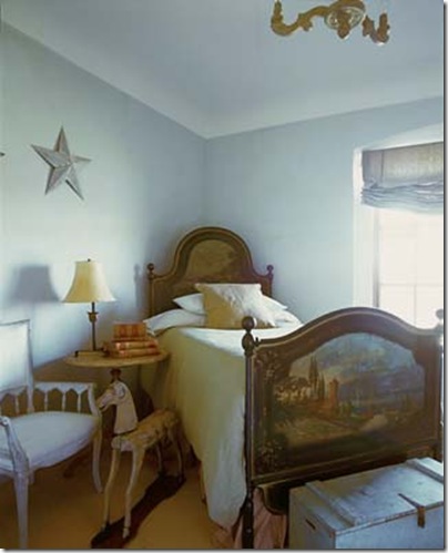
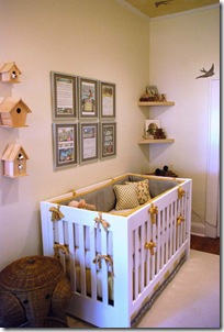
Though not necessarily a nursery, this child’s room could be a more grown up version of the one above. When I see a room like this it immediately reconfirms how simplicity can be so elegant.
I love how the curtain treatment above creates a dramatic focal point and introduces a subtle dose of color. There are so many pretty fabrics to choose from, and creating a swag around the crib can be a wonderful way to show them off. The matching bedding, crib ties and hanging mobile are elements on my “must” list.
A nursery for le bebe francophile! The neutral tones of this nursery are so calming, and everything is so pretty on it’s own that color might even be a distraction. I love the shelf on the wall with hooks for pretty outfits, baby blankets, and other odds and ends.
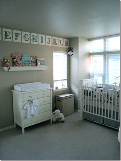
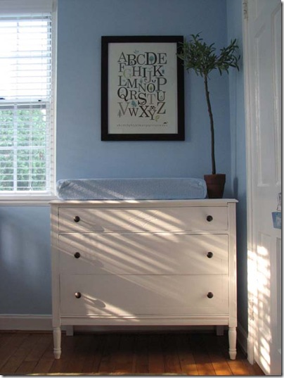
Another neutral room that proves color can come in the accessories. As a lover of typography, I think these alphabet flashcards are a perfect decoration!
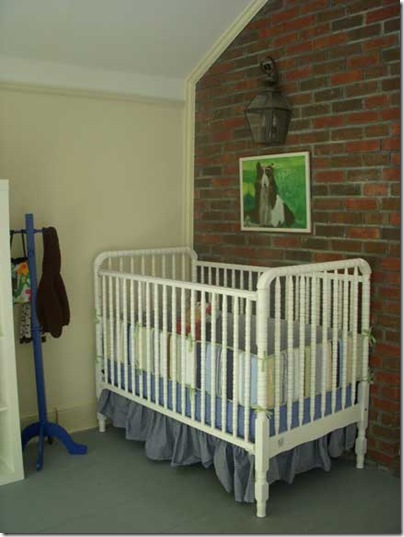
Proof that a French lantern really can go anywhere!
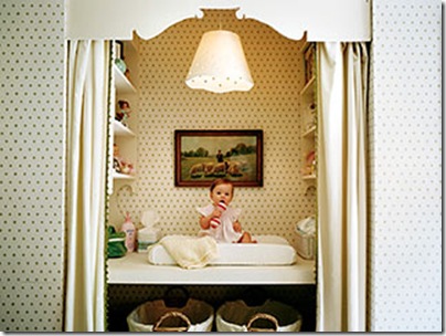
Innovation goes chic with this pretty closet-turned-changing table alcove. I love how the repetitive use of the simple dot pattern ties everything together (notice it’s even lining the inside of the pendant). The curtains have a coordinating green ball trim on the leading edge and the custom cut valance top are just icing on the cake.
A little bolder, this room took advantage of the wall the baby will be see most often- the ceiling! Fresh colors, accessories and tailoring, this is one charming little room.
I’m not using a theme in my baby boy’s room, but I do love the idea of globes and maps. Nice sign too!
One of my fears as a designer/soon to be mom is that a baby’s room turns into a sea of primary colors and plastic toys scattered about. While I know that's not completely unavoidable at times, I love that the vignette above brings fresh greenery and sophistication to the space. And a pretty dresser like this is the perfect place to stash all the toys and baby gear!
I’ll post some pictures of the progress of my nursery as it progresses (currently everything is piled in the center of the room with a dropcloth over it as the walls get painted!), and I’m sure you’ll recognize several details from these inspiring spaces!
{Images via Veranda, Palm Design Group, Better Homes and Gardens, Alkemie, Ohdeedoh, Cottage Living}





Thanks for your comment on my blog. I love this post. Can't wait to see what you come up with!
ReplyDeleteOh my goodness - that first picture is extraordinary!!!!!! I want to do a nursery like that now!
ReplyDeleteThese rooms are absolutely gorgeous!! My kind of post :-)
ReplyDelete